


New client, new curriculum. Taking on a new project always evokes a back to school energy for us. Fresh pages, a schedule to memorize, a mix of familiar and new faces. A new problem to solve, a new industry to learn, and those first day jitters of excitement. We don’t know exactly what’s to come, and that’s the whole point. Nothing is decided yet.
We don’t think about new client work as just a brief to execute. It’s a school year we haven’t yet lived through. One where the syllabus gets written in the first few weeks, not handed to us on day one.
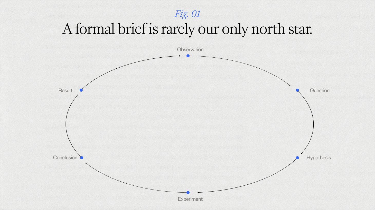
A formal brief (objective/goal, fill in the blanks) is rarely our only north star. What a client hands us is a starting point, and it’s on us to draw the map. Our route is shaped by questioning: what’s the real problem; what are we actually trying to get to the bottom of?
So when a new client shows up, we don’t reach for a template. We start with a hypothesis, and we build a curriculum. We go back to school:
Science: know your hypothesis
Every project starts with a problem, and it’s never one we invent. It’s the one the client walks in with. Sales are flat, no one can quite describe what the brand stands for, something just feels a little off. Before a single visual gets touched, we’re doing the research: qualitative, quantitative, whatever the problem actually calls for. Then we form a hypothesis and spend the rest of the project testing it against everything we make. Sometimes the hunch holds all the way through. Sometimes it changes completely three weeks in. Either way, nothing gets built on an assumption we haven’t checked.
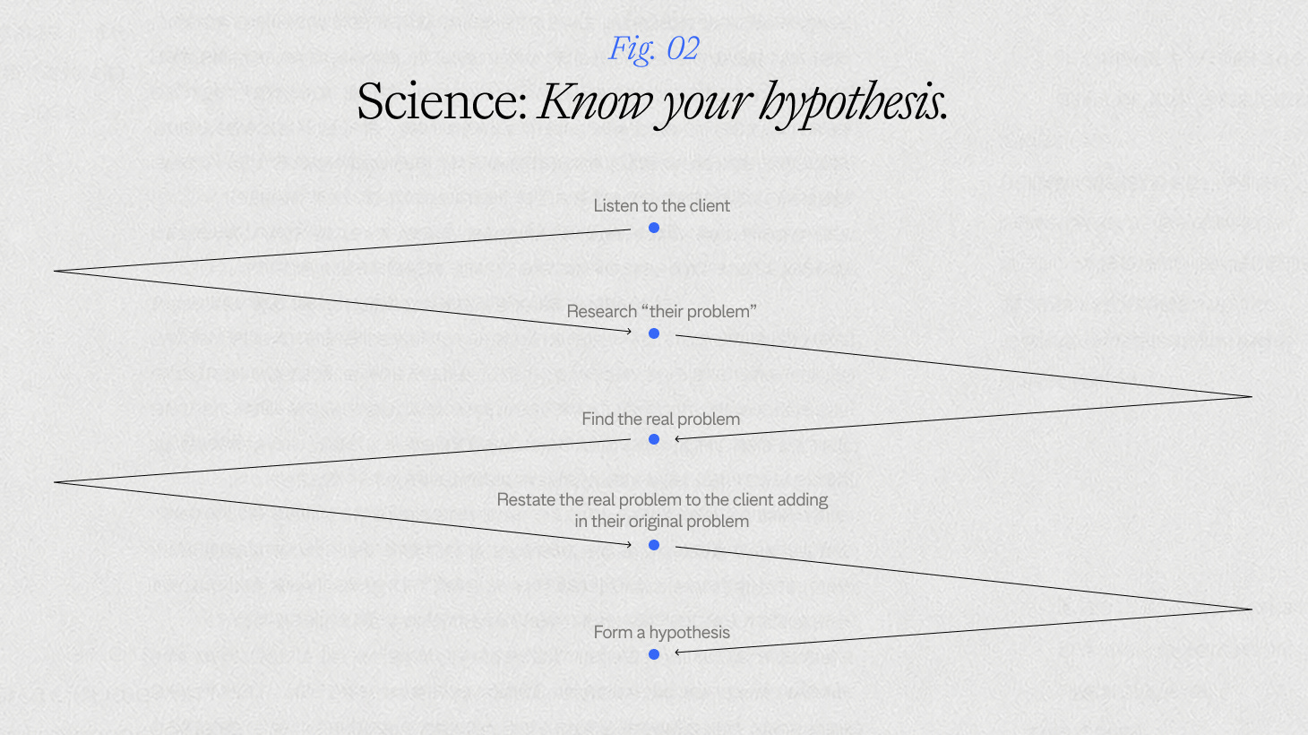
CMP (Customer Management Practice) came to us describing itself the way most companies do after years of heads-down work: a service provider, delivering reports and events, largely mirroring what was already happening in its industry. From the inside, that read as a fair description. The problem wasn’t visible yet. Research surfaced the gap: what if CMP wasn’t a service provider at all, but the industry’s compass, the source that sets the direction rather than just reflecting it. That became the hypothesis, and every piece of the rebrand (tone, positioning, headlines) got tested against it until it held up.
Social Studies: know the room
Who’s actually in the room? Where does this audience hang out, literally and culturally? What’s the brand’s history, and which parts of it are worth keeping versus quietly retiring? Social studies is about context: not just who the brand is, but the world it’s operating inside of, who that world already trusts, and what that audience needs from a brand before it’ll give that brand its attention.
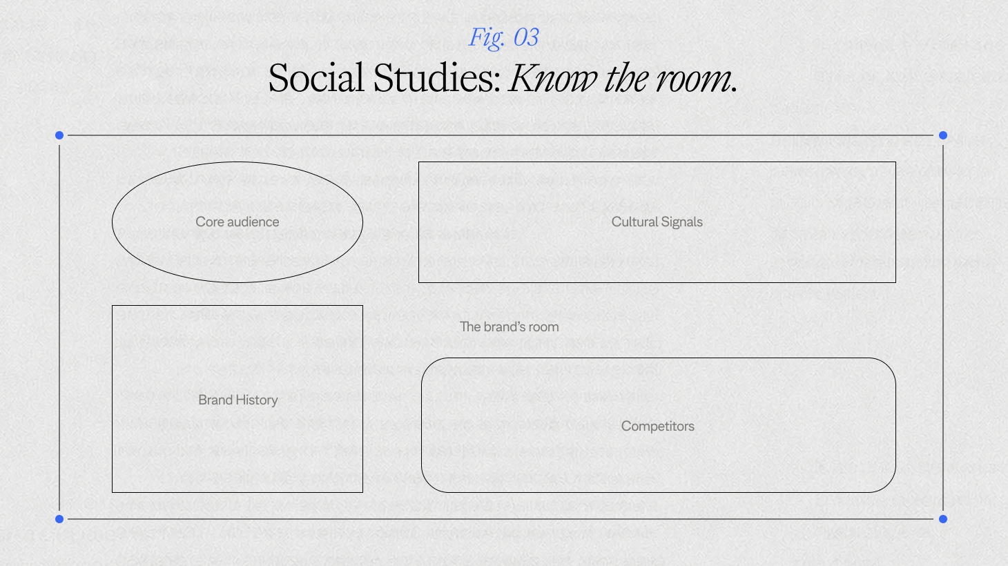
Federato is a good example of taking that context seriously. Their audience isn’t broad; it’s senior P&C insurance leaders, the kind of room that gets curated by application, not open registration. So when we worked on Federato’s presence at their own Insurance Leadership Summit and at ITC, the brand had to hold its own next to Goldman Sachs and Anthropic on the same stage. Less startup-scrappy, more of the executive, high-end register that room actually speaks.
Language Arts: know the voice
Tone is deceptively hard to teach. This is where we figure out how a brand actually wants to sound; not the adjectives on a mood board, but the real, specific difference between how it could speak and how it should. Confident or approachable? Deadpan or warm? Every brand has a voice already; half the work is just getting them to hear it.
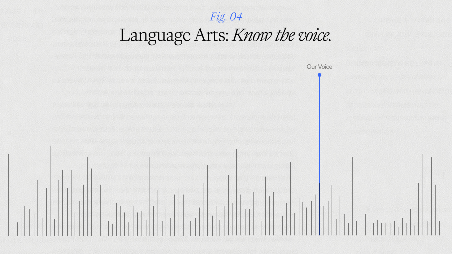
Final Offer is a good example of that work paying off. Underneath the product — a real estate platform showing price, offers, and competition in real time — was a much simpler idea trying to get out: sellers, not buyers, actually hold the leverage in a home sale. Once the voice pillars landed on fast, modern, and seller-focused, the headline followed almost on its own: Sellers hold the key. From there, the rest of the messaging is the same idea from different angles: “time the market in minutes, not months” leans into speed, and “every home has a price, what’s your Final Offer” leans into leverage. Different entry points, same conviction.
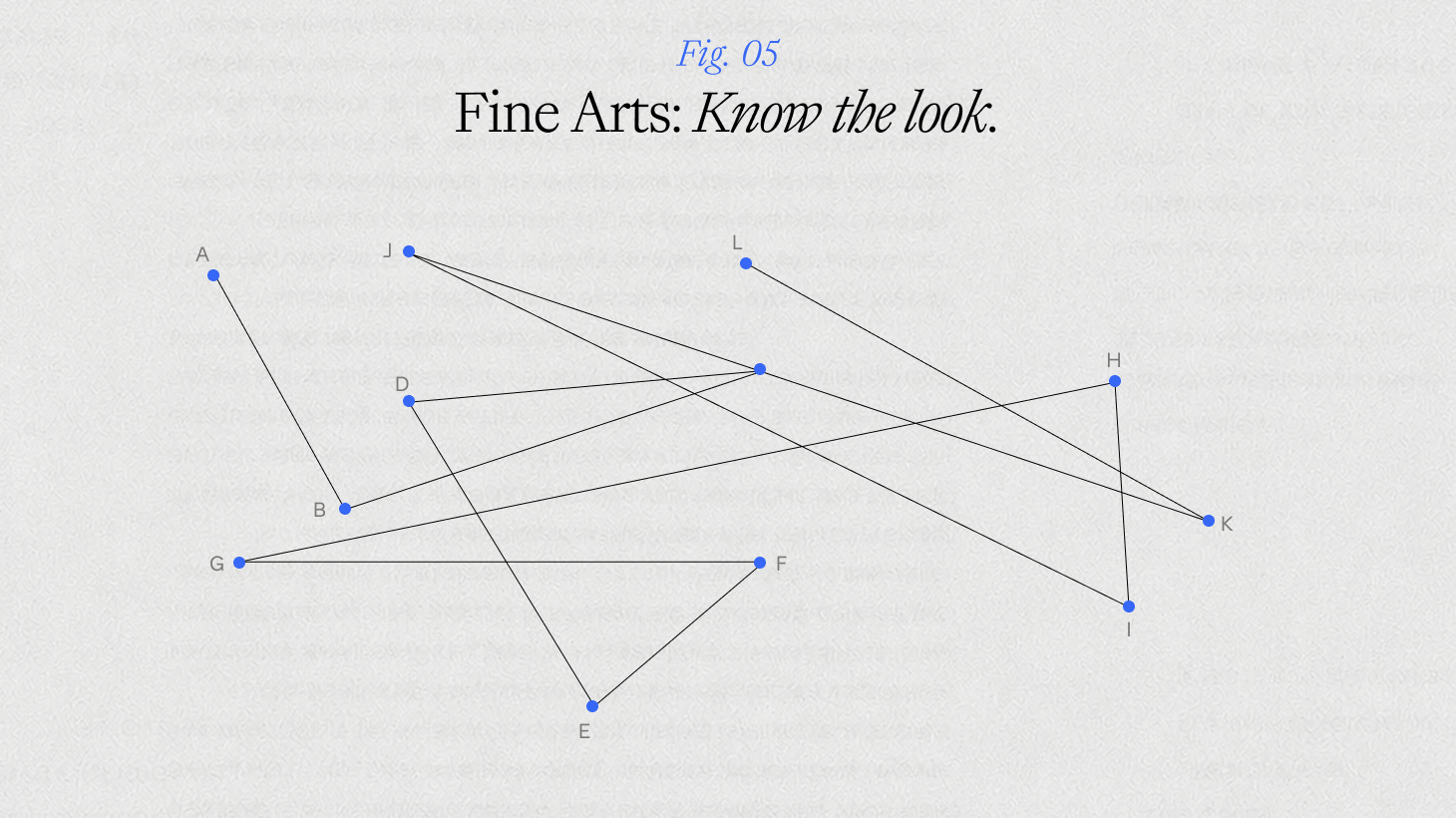
Fine Arts: know the look
Almost last, but never least: the visual direction. Once you know the hypothesis, the room, and the voice, the visual language stops being decoration and starts becoming the argument. This is where everything else in the syllabus gets a face.
Mochi Health is a good test of that. Health brands default to clinical: sterile, cold, more pharmacy than person. Mochi’s strategy statement we developed was “care for the complete you,” so the visual system had to actually look like care: real, unstaged photography of real patients and medications, warm and human rather than polished. The harder problem was that Mochi spanned a lot of ground (weight loss, skincare, hair, relationships, symptom support) and each needed its own identity without the brand splintering. The solution was a color and icon system, all built on the same foundation, so a weight-loss ad and a skincare ad read as clearly different and unmistakably the same brand at once.
Mathematics: know the numbers
Every project ends up back here: the targets, the demographics, the KPIs someone in a boardroom cares deeply about. Are we growing sales? Growing awareness? Growing something else entirely? This is ultimately how we measure success with our work in solving a brand’s growth. It’s not the fun subject. It’s also the one you can’t skip a single class of.
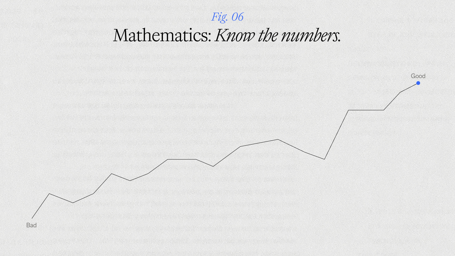
Our work with Backbone is a live example. We built a clear system to differentiate their product offerings yet unite them under a single brand foundation so that they could easily track their sales and the success of their brand message. If the number didn’t move, the lesson didn’t land.
Technology: know when to build it yourself
We’d be lying if we said the classroom looked the same as it used to. We can’t avoid working with certain technologies, or in certain industries shaped by them. That’s just the world right now. We’re not interested in drawing a hard line around that, or pretending it isn’t part of the work. We’re interested in approaching it with the same curiosity as everything else: figuring out how to coexist with it in a way that actually benefits the work, and the people doing it.
Sometimes that means building the tool ourselves.
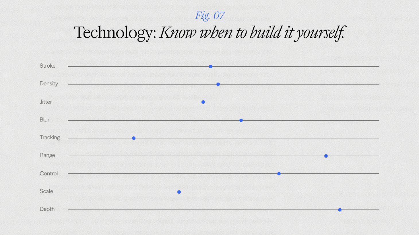
For Emergence (a brand about growth, fittingly) our Design Intern, Lydia, built a set of digital drawing tools to visualize different forms of growth. Each one starts from a simple rule, such as how a root spreads or how curves nest inside each other, and then it’s let loose until it fills the screen. One was created for the brand itself, along with eight more for each industry it touches. The main challenge: show the same capacity for expansion and growth across the main brand and its industries.
This is a small example of a bigger habit: we're not just applying technology as clients need it, we're learning it and building with it ourselves. Technology has become a frequent component of our creative deliverables.
No extra credit for rigor
Here’s the part we want to be clear about: this isn’t about academic rigor for its own sake. Nobody’s getting graded on a curve. Almost nothing from the advanced coursework actually shows up in the work later. What you end up reaching for, over and over, is the foundational stuff. The basics.
So the point of going back to school isn’t discipline, it’s curiosity. It’s the willingness to ask a basic question again, even about a brand that’s been around for a decade, instead of assuming you already know the answer because you did the reading last semester. Every subject here is really a different angle on the same question science handed us at the start: the hypothesis. They all have to ladder back to it, or interrogate it. Tested against the same hunch until it holds or gets rewritten.
New semester, new client, same instinct: ask the question again, take the syllabus seriously, and remember that the best lessons usually get rewritten halfway through the term anyway.