


Most rebrands chase a new look to create a buzz or to reach a new audience. Evergreen, a cultivated meat company, was chasing clarity. Surface level sheen wasn’t going to work here (and we don’t think that works anywhere). Our job was clear: to make them look, and sound, more like themselves.
A brief history
Five years ago, alternative meat was having a moment. Beyond Meat went public in 2019 with one of the most successful IPOs of the decade, followed by a two-year run as a stock market darling. A wave of companies promised a more sustainable future, and the pitch made sense on paper: less environmental harm, less land use, less water.
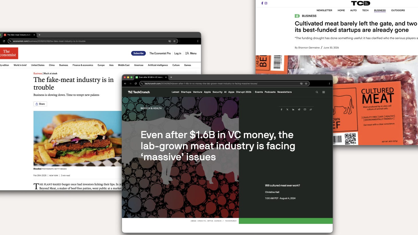
But the category had a taste problem and a trust problem. Sales of plant-based meat in the US declined for three consecutive years through 2023, and funding to alternative protein startups fell from over $2 billion in 2019 to roughly $250 million in 2023. Consumers who tried the products once didn't necessarily come back; taste, texture, and price all worked against repeat purchases.
A cosmetic refresh yields superficial results.
The company that would become Evergreen started in that wave, under a different name. By the time they came to us, the industry’s first chapter had already played out, and the business itself had changed. The plan was no longer to sell a packaged consumer product positioned as an alternative to beef. It was to become something more fundamental: infrastructure for the existing meat supply chain, blending cultivated and traditional beef to help producers manage cost and consistency without changing how the product tastes or where it ends up.
Evergreen didn’t need a cosmetic refresh. They needed to reintroduce themselves: a rebrand to better represent the business that had already changed underneath it.
A rebrand isn’t reinvention; it’s revelation.
The instinct with anything new is to sell the new-ness. But the audience that mattered most here (meat processors, distributors, ranchers) had already watched one generation of “the future of meat” promises underdeliver. Novelty was a liability, not an asset, in that room.
What they needed wasn’t a more convincing pitch for disruption. They needed evidence that this was something they could build a business on without risk. And cultivated meat had the potential to do more than just disrupt: unlike plant-based meat alternatives, it could eradicate major players in the beef industry entirely.
They needed a clear story that hinged on what they already knew to be true. Industry fears amid an uncertain future was the backdrop, and Evergreen the solution. A new product not just playing nice and not just assimilating. It was here to enhance, giving strength and longevity, to what already existed.
A visual system is a start. The verbal identity is the finish.
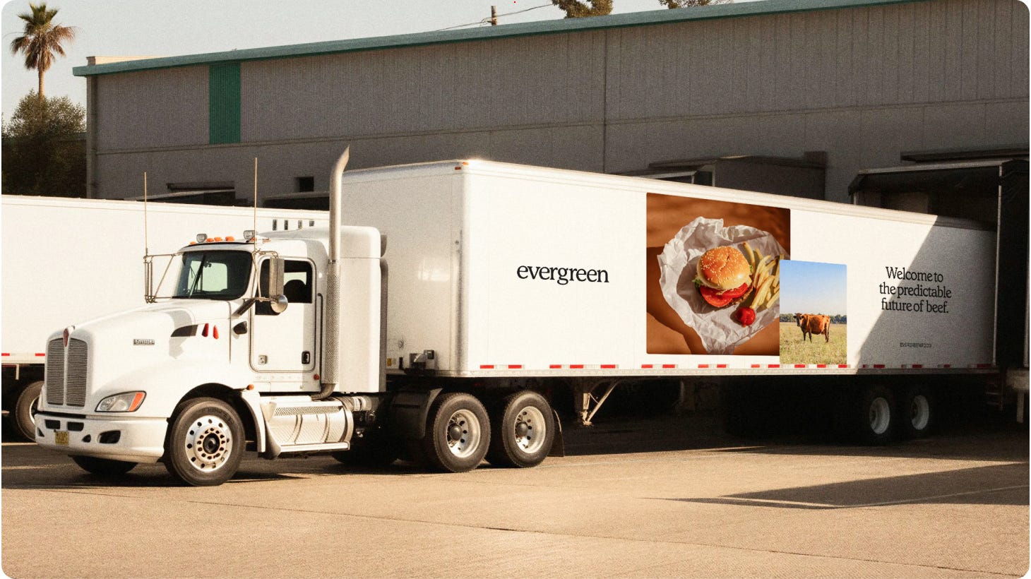
The work centered on strategy and verbal identity more than the visual system. The name and message had to do the heavy lifting of repositioning the company entirely: not a challenger to beef, but a partner to it.
The tagline “the future of beef is beef” carries that reframe in six words. It refuses the disruption narrative outright. Internally, the brand needed to be science-forward and rigorous: credible to investors and meat-industry partners evaluating real infrastructure risk. Externally, the message simplified to what actually matters to the market: the burger on the plate, not the process behind it.
Build for the pitch room, and the boardroom.
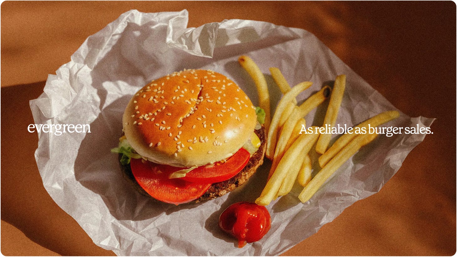
The brand had to hold up in a boardroom of investors and in a meeting room of meat processors: two audiences with very different thresholds for what "credible" looks like. The design system reflects that split: rigorous, infographic-driven communication where precision mattered for investors evaluating risk, paired with warmer, food-forward photography and language everywhere the message reached an external audience.
Nowhere does it borrow the visual vocabulary of biotech: no sterile labs, no clinical detachment. The goal was for it to feel like food first. Credible enough to win a round of funding. Appetizing enough to belong on a plate, not just in a pitch deck.
A rebrand isn’t a reset button.
The market is full of brands that change their name and identity hoping a new look will resolve a trust problem, a stalled pitch, or a category that’s lost its shine. Most of the time, it doesn’t, because the rebrand isn’t attached to anything that’s actually different. It’s chasing style instead of change.
Evergreen’s rebrand worked because the business had already changed first. The name didn’t try to manufacture a new story; it gave language to one that was already true. That’s the real principle: a rebrand isn’t a chance to reinvent who you are. It’s a chance to finally say, clearly, who you’ve already become.