Before Water Cooler was a Substack, it was a Slack channel. #water-cooler is where our team at Company Policy actually talks. Not about deliverables or deadlines, but about whatever’s caught someone’s attention that day in the realm of ideas, inspiration, or general interests. A hand-built sculpture made from bent wire and dried flowers. A 1980s devil-themed film score. A hex-crawling tabletop game rulebook. A quilt sewn sometime before any of us were born. It’s updated constantly, with no agenda beyond “look at this.”
None of it has anything to do about the actual work we do, and that’s the point.
We believe the best inspiration comes from outside your discipline, and recently we decided to launch a series on what’s inspiring us lately, called Field Notes. It’s a glimpse into what we’re sharing in real time, and what’s ultimately feeding ideas in our brainstorms. Individually, they are sparks. Together, they create connections. That’s where the real magic happens.
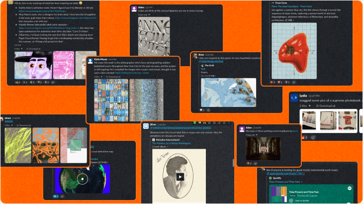
This is the same thesis we opened this newsletter with. The reference points sitting inside your own discipline are the ones everyone else in your discipline is already looking at. If you want to make something that doesn’t look AI-generated or assembled from a competitor’s Pinterest board, you have to look at fields that have nothing to do with yours.
A few things we’ve noticed, looking back at at our first volume of Field Notes:
The best references don't map cleanly onto the problem you're solving.
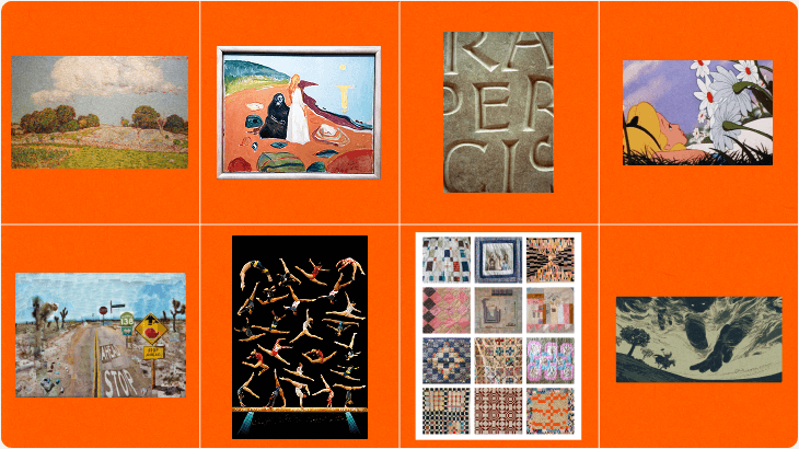
Nobody opened a client brief for a rebrand this quarter and said "the vibe they're going for reminds me of a Munch painting, a Sam Maloof quilt, and a woodcut of a horse's feet." But somewhere in that pile, something clicked. A landscape painting for its color palette. A gymnastics montage for its choreography. A stretch of desert highway for its patience. None of it was chosen to solve a specific problem. It was pulled because it was interesting, and interesting things have a way of becoming useful later. That, to us, is immediately relevant: this is exactly how we want to approach building a creative platform.
Texture and craft read across mediums.
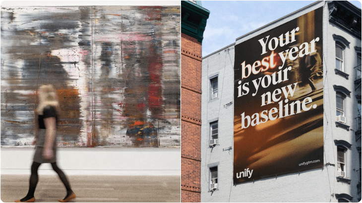
A bright-colored painting, a vintage quilt, a frame from a hand-drawn film: none of these are specifically about typography or color theory, and all of them are teaching the same lesson: something made carefully by a person, at a human scale, has a quality that’s hard to fake and easy to recognize. That’s as true of a logo as it is of a quilt block. It’s also why a Gerhard Richter painting can end up informing an outdoor campaign.
Richter’s blurred, motion-streaked canvases aren’t about advertising at all. They’re about the moment a clear image becomes something else entirely when it’s set in motion. That same idea shaped the photography direction for Unify: bodies and light captured mid-motion, blurred just enough to feel like momentum rather than a frozen instant. Unify’s client brief held no inkling of reference to postwar German artwork. But the instinct to let an image blur toward abstraction, to let motion do some of the storytelling, came from somewhere; and that somewhere was a museum wall, not a campaign deck.
Nature keeps showing up, unprompted.
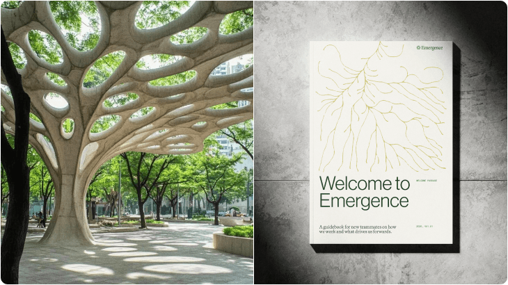
More than one entry this volume traced back to an artist whose whole practice pulls from natural forms and cycles. Nobody set out to find “nature-inspired inputs.” It just kept happening, independently, across different people’s feeds. When the same idea surfaces from unrelated directions without anyone coordinating, that’s usually a sign it’s worth paying attention to. That instinct is exactly what shaped Emergence.
A tree canopy, its structure branching and forking outward from a single root, became the reference point for how the brand needed to feel: less like a fixed identity and more like a living system, growing in real time. That thinking carried straight into the guidebook itself, where the same branching, root-like lines run across the cover, tracing outward the same way an idea does as it spreads and takes shape. Nobody opened the brief and wrote “make it look like a tree.” But the underlying logic — growth that happens organically, structure that emerges rather than gets imposed — came from watching how nature actually builds itself, not from a mood board of “organic” brand marks.
TL;DR: Old things are doing new work.
An animated film from decades ago. A soundtrack pulled out of a used record bin. A quilt with no attribution at all. None of these are “vintage” in the aesthetic sense: they’re just proof that good composition and good color don’t expire. If anything, distance from the present moment is what makes them useful; they haven’t been picked over yet.
We don’t think any of this is a formula. That’s sort of the whole argument. The moment “look at unexpected things” becomes a checklist, it stops working, because it’s the searching that matters, not the sources. But it is a habit, and it’s one worth building on purpose. The team that’s collecting hex-crawl game manuals and Norwegian expressionist paintings in the same week is going to bring something to a client brief that the team scrolling the same ten agency accounts everyone else follows won’t.
So: keep the reference pool weird. Keep it wide. The next good idea for a client’s brand is a lot more likely to come from a record bin than a mood board.